Why redesign
v1 worked. Real apps shipped on it. But the UI looked old. TailAdmin patterns. Inconsistent components. Dark mode bugs.
The stack was ready for production. The first impression often fell short.
People kept saying the same thing. Great template. Hard to customize the design. v2 had to look like the SaaS product it helps you build.
The design problem
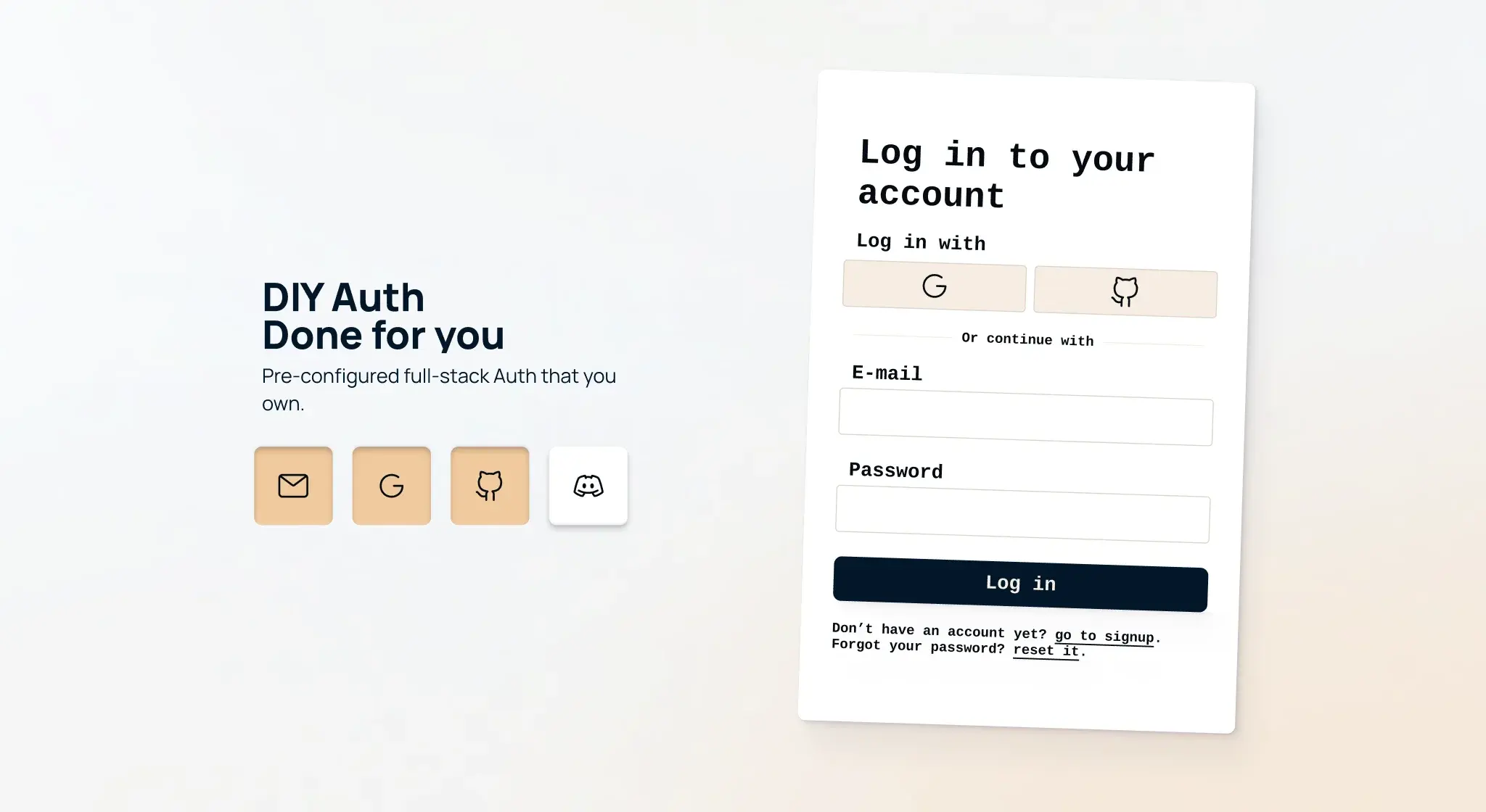
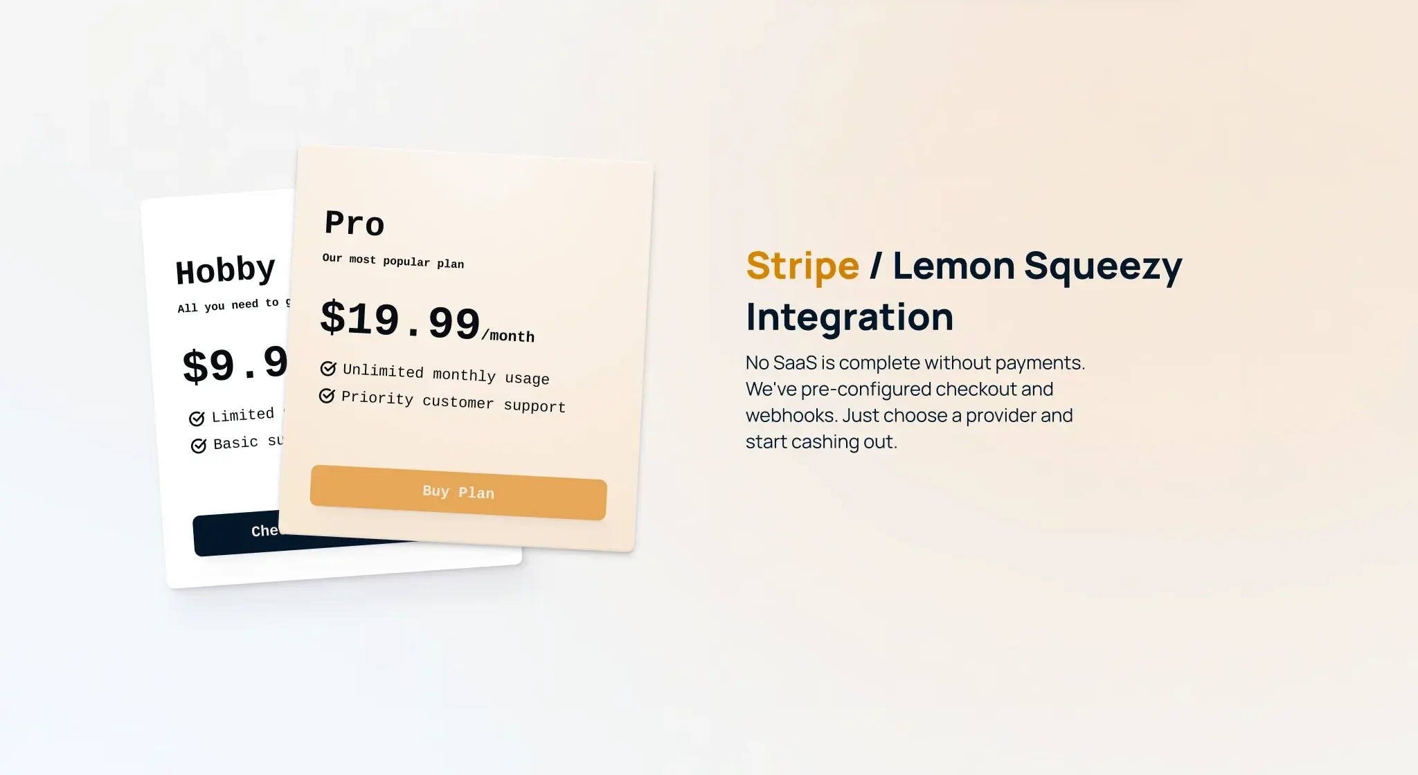
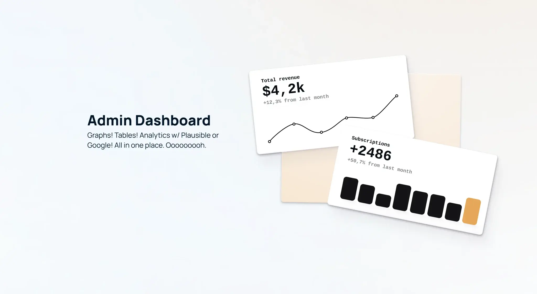
This was not a landing page refresh. I redesigned auth, the app shell, billing, settings, admin dashboards, marketing pages, and dark mode.
The stack had to stay Shadcn and Tailwind. Builders fork this repo on day one. They retheme it. Every screen had to feel like part of one system.
What I did
- Moved the app to Shadcn UI. Cleaner hierarchy. Consistent spacing. Same patterns on forms, cards, and dialogs.
- Reworked login, signup, the dashboard shell, pricing, checkout, admin tables, and analytics views.
- Fixed the details that show on launch day. Dark mode. Form states. Upload progress. Cookie consent.
- Set up theming so future landing pages do not fight the component library.
Redesign concept
I started with a concept video. No production code yet. I explored layout, motion, and hierarchy. How the hero should feel. How feature sections should breathe. How auth and dashboard patterns fit one system.
High fidelity designs
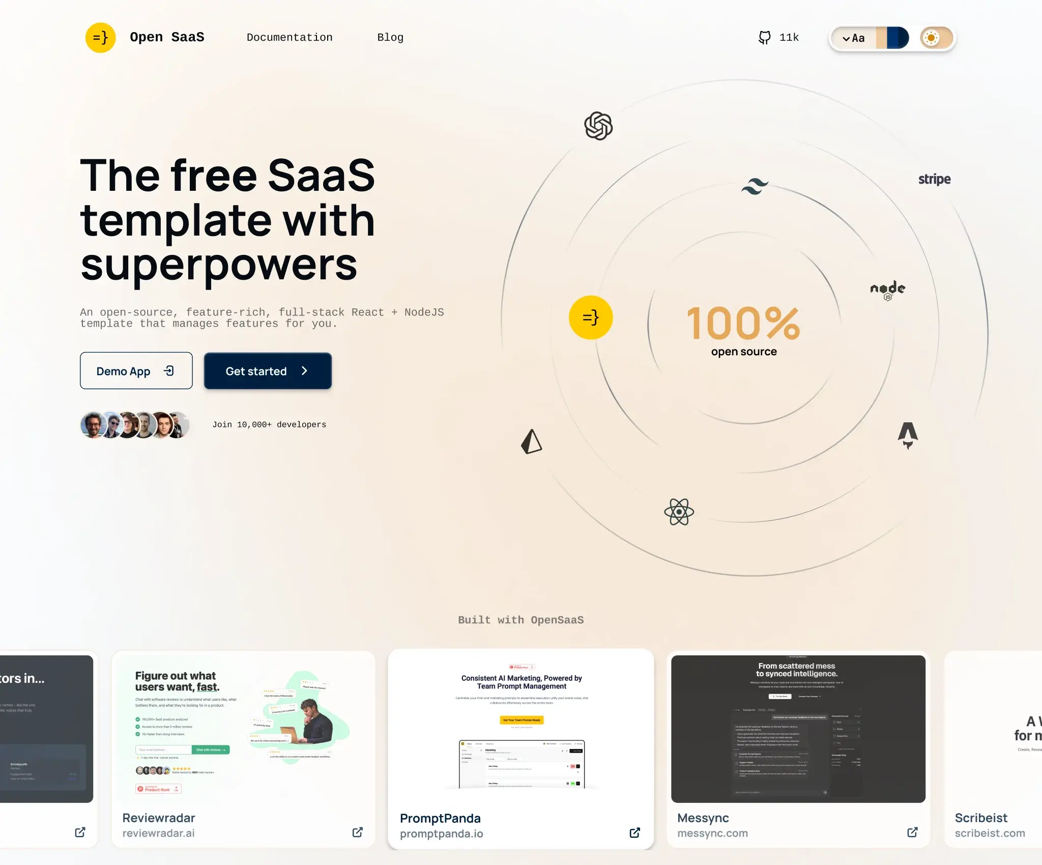
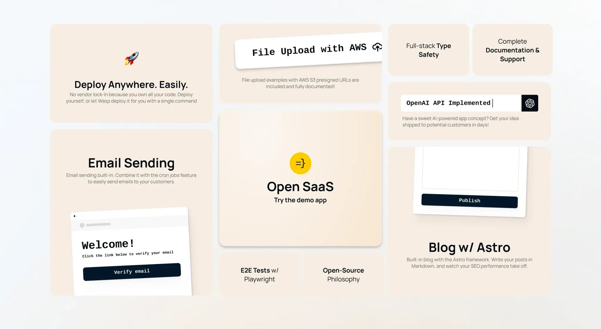
Then I moved to high fidelity. Marketing pages. Auth. Payments. Admin. The features grid. These screens defined what shipped in v2.0.
Launch day
We shipped v2.0 on July 29, 2025. Product Hunt. Hacker News. A big community push. The redesign led the release. The Wasp team also shipped AI-ready docs, Playwright E2E tests, and new payment providers. I handled the UI. They handled the rest.
producthunt.com
Open SaaS 2.0 on Product Hunt
v2.0 launch. Free, open-source SaaS boilerplate for the AI era.
Check it out live
wasp new -t saas.opensaas.sh
Open SaaS
github.com
wasp-lang/open-saas
15k