About
My Role
SityUp began as a solo passion project and is now a small team effort.
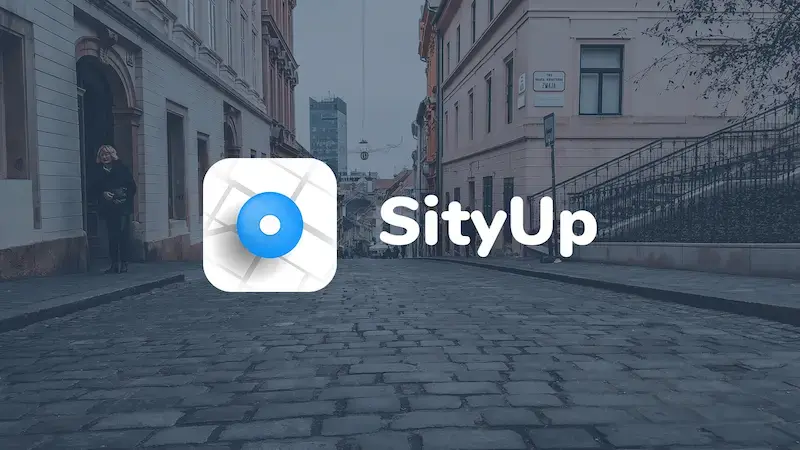
I owned the full visual identity, icon, UI, and UX. This write-up focuses on the product UX; here is the icon first.
User Profile
Young travelers, roughly 19–30, often abroad for school or work and still learning a new city. They hop between cities instead of staying put for whole trips.
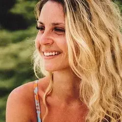
Laura Lopez
, 23
- Born in Barcelona
- Taking a gap year and backpacking around Europe. She's open to new experiences and wants to explore the world.
- Although there's nothing wrong with planes, trains and buses are her preferred ways of transport, and she has no problems with hitchhiking.
- Every single tourist guide recommends places every single tourist has seen. She wants something new and exciting.
- Uses TripAdvisor to find places locals frequent with little to no luck. Asking random people on the street sometimes works the best.

Zach Morgan
, 22
- Film student from Liverpool
- Always looking for interesting places to photograph, but wants his photos to be special and unique.
- Recently moved to Amsterdam for his Master studies.
- Doesn't feel like he knows the city he's living in well
Zach has more time to hunt for the right challenge, so filtering matters. If someone installs the app only after they arrive, onboarding should stay light.
Choosing a challenge
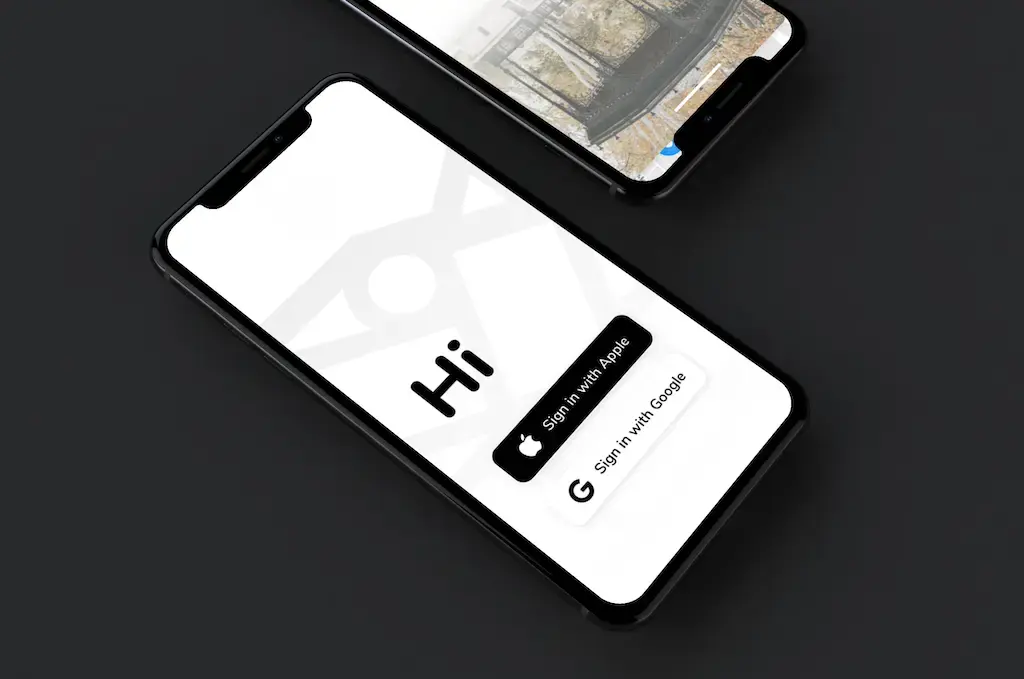
On open, drop the user into their current city and ask for location permission when it matters. Suggestions mix past behavior with where they are now.
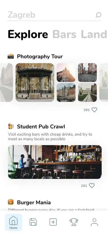
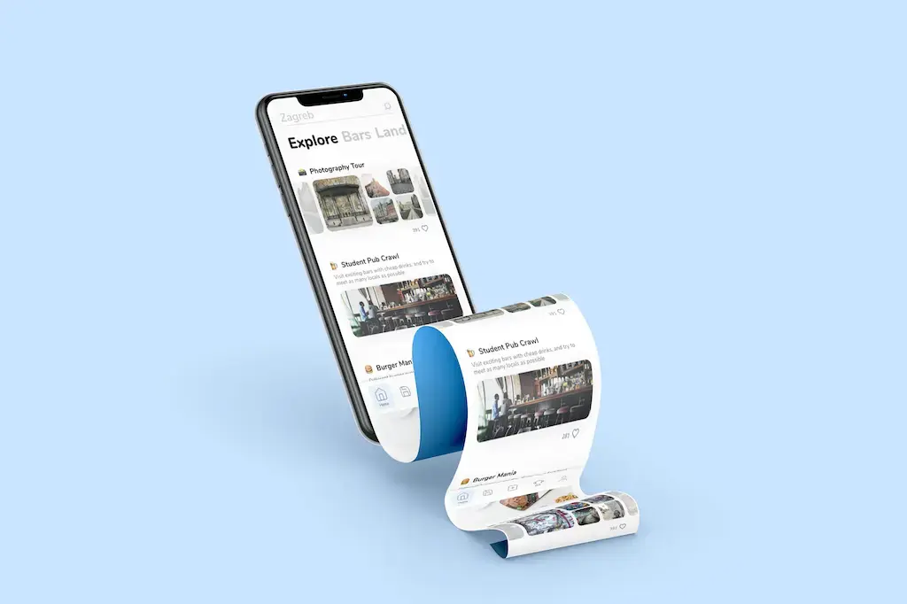
Categories are the simplest way to expose different challenge types, help people pick a fit, and learn preferences quickly.
Prototype
Starting the Application
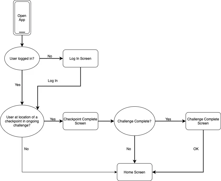
The app checks on startup if the user is on a checkpoint of any of ongoing challenges before kicking them into the main app flow.
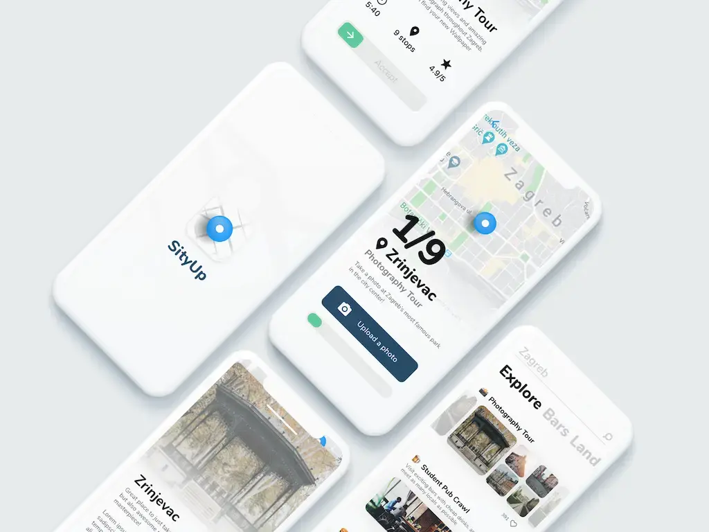
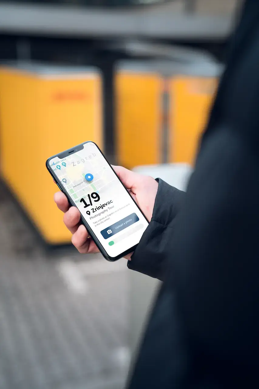
Finding a Challenge
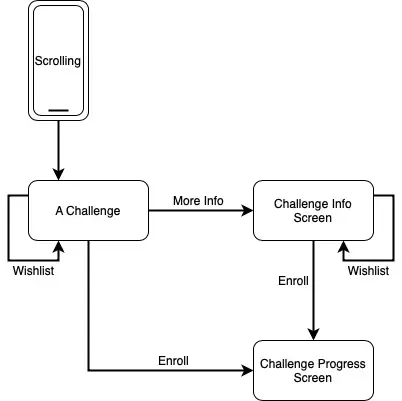
The biggest challenge was the challenge info screen. I wanted to put an interactive map and the description of the challenge in one screen.
After testing it, I realized people were fine with just seeing an overview of the checkpoints and seeing map details only when they intentionally tap on them.
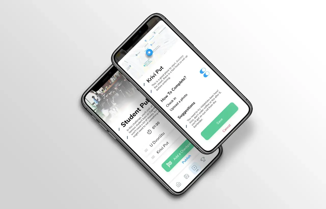
Creating a Challenge
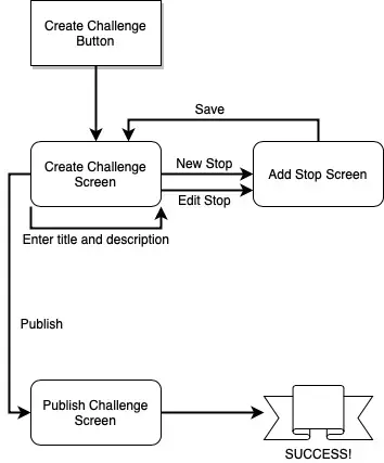
Authoring a challenge on a phone was the hardest flow. Rivals often offload creation to the web. We still wanted full creation in-app if the community was going to grow there.
People should add checkpoints in any order and tidy sequencing later, so checkpoint entry lives on its own screen away from the challenge summary.
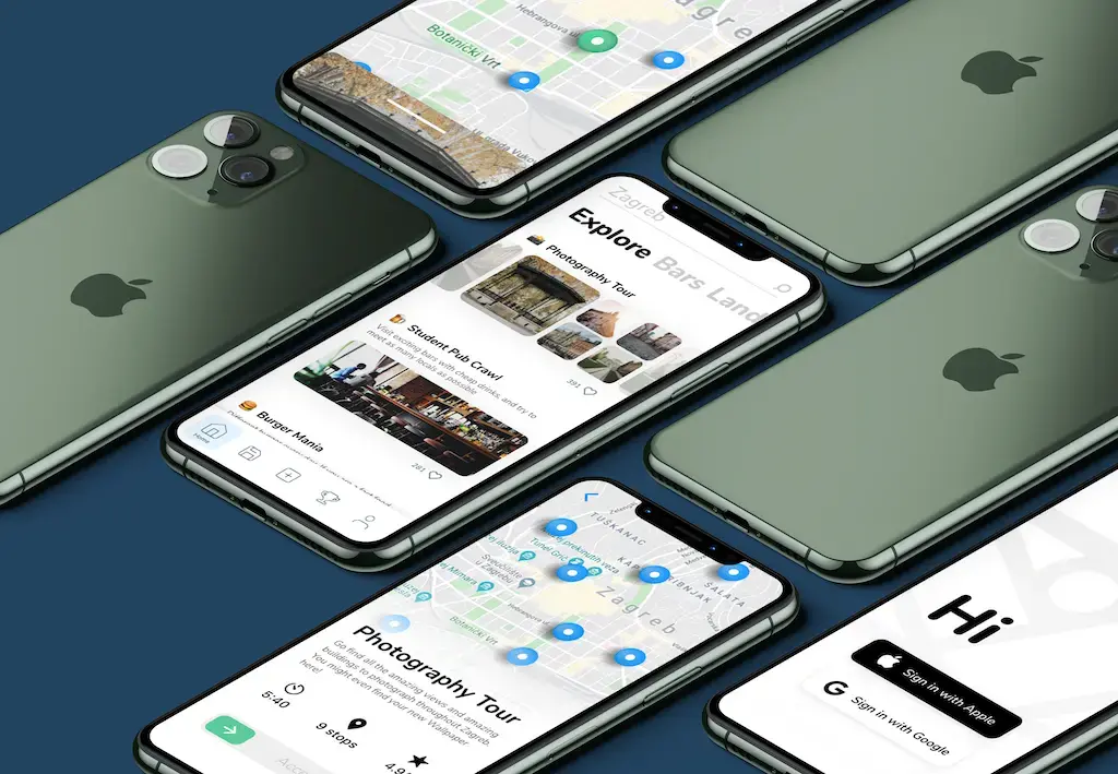
Mockups
What I Learned
First real startup project for me: keep the design simple for speed, but not cheap. The shipped app will likely drift from these mocks.
I will update this post with the release and an App Store link when it ships.