What is XAgo?
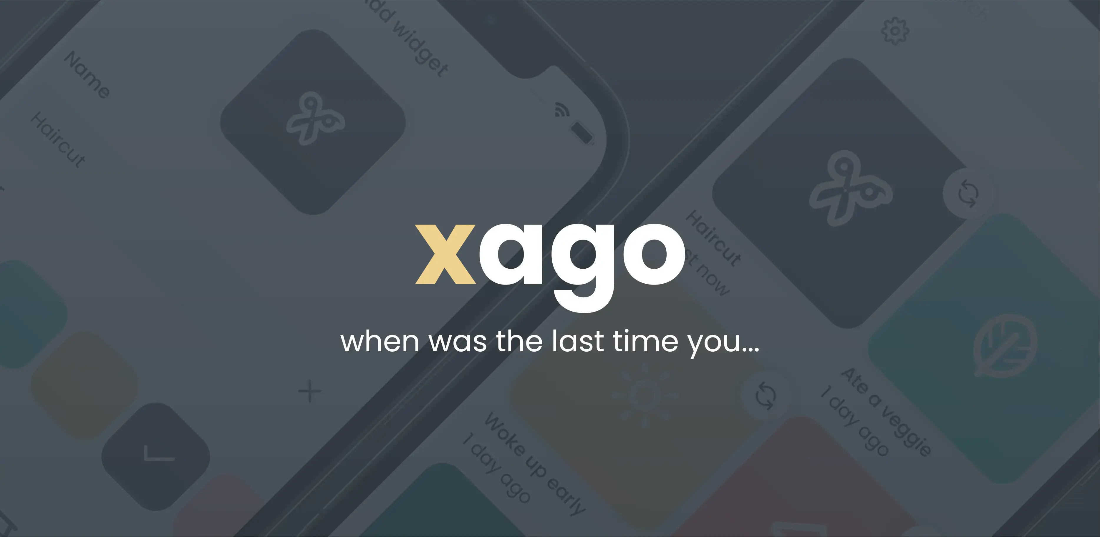
XAgo is a simple app that lets you keep track of how long ago you did something.
The Coding Challenge
I gave myself one week to build the app from scratch and ship it on the App Store and Google Play.
Although there was a time limit, I didn't want to cut corners on features. Below is a checklist of everything the app needs to do/support.
Checklist
The app has to:
- allow users to create event trackers (later widgets)
- allow users to edit widgets after they're created
- allow users to customize widgets (change color/icon)
- work well on phone screens
- work well on tablet screens
- have an overview of every time an event was repeated
- have support for dark mode
- have proper internationalization (later i18n)
Technology
Native iOS and Android are not my home turf. I built a little Android in my first year of college, then mostly stopped. I have poked at Swift, but not enough to ship something this tight on native stacks in seven days.
React and React Native are where I spend my time. I wanted this project to level up theme support (light, dark, and in between) and to ship a full TypeScript codebase.
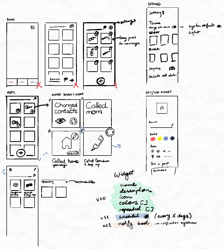
Sketches
I could have spent weeks on visual design, but this was a developer challenge, not a design sprint. The idea had been sitting in my head for years, so the flow was already fairly clear. I sketched enough to lock layout and primary interactions, then opened the repo. Setup had to happen early if the week was going to work.
The week of development
Monday
This day was mostly project setup. In the end, the app had support for:
- Inputting the name of the widget
- Choosing colors for the widget
Tuesday
On the second day, I worked more on layout and was messing around with saving dates. At the end of day two the app supported:
- Choosing the date to start tracking from
- Choosing an icon for the widget
I remember that on Tuesday the app already looked like a good proof of concept. I wanted to just stop and say "that's it, I could finish it whenever I want". However, when I looked at the checklist again I realized I only supported the first few checkpoints.
Wednesday
I didn't have much time to work on the app on Wednesday. At the end of the day, the app had support for dark mode and for editing widgets. I also refactored navigation a bit and added a widget detail screen.
Thursday
Thursday was all about themes. At the end of day four the app supported:
- Switching between different light and dark themes
- Manually setting preferred UI style (dark/light/system)
Friday
On the fifth day, I mostly worked on the settings. I began working on the i18n support and added a few more themes. I also added some haptic feedback for key interactions.
Saturday
On Saturday I polished the UI and refined the widget detail screen. I dropped third-party calendar pickers; they were slow or unreliable enough to be a net loss.
Sunday
Sunday was the day of final touches. At the end of the last day I:
- Designed an icon
- Designed the splash screen
- Designed App Store and Google Play Store screenshots
- Added simple onboarding screens
- Finalized i18n
Final App
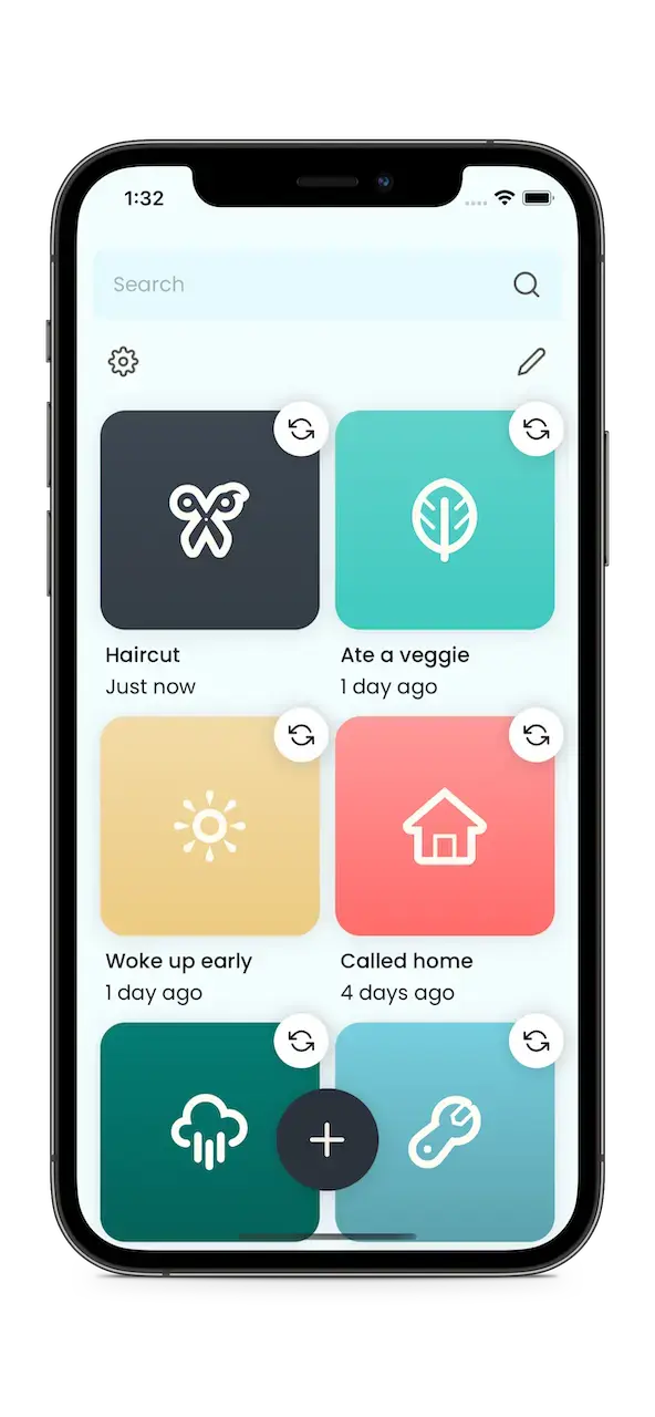
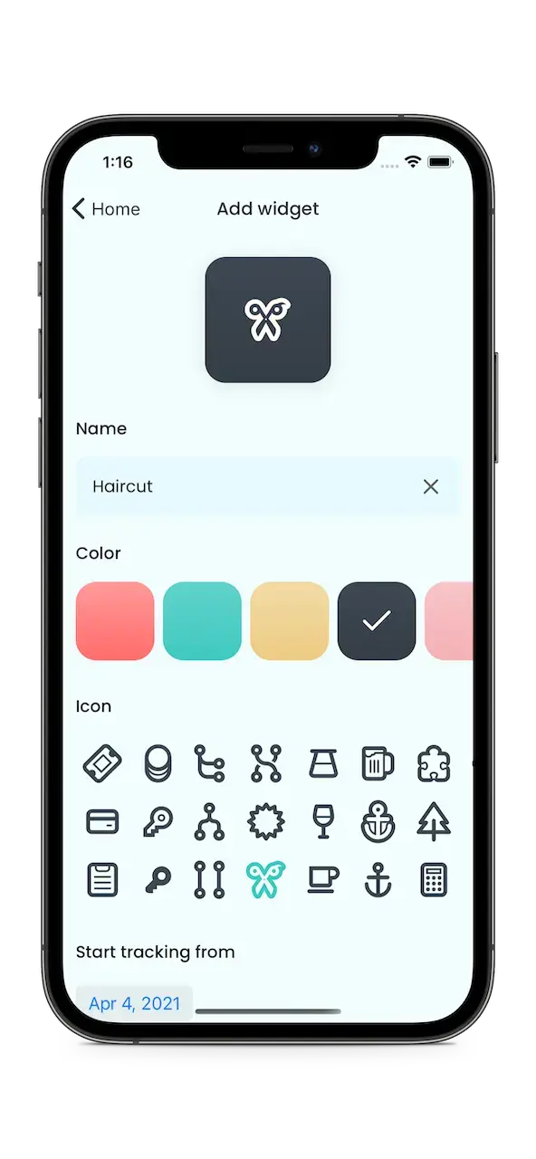
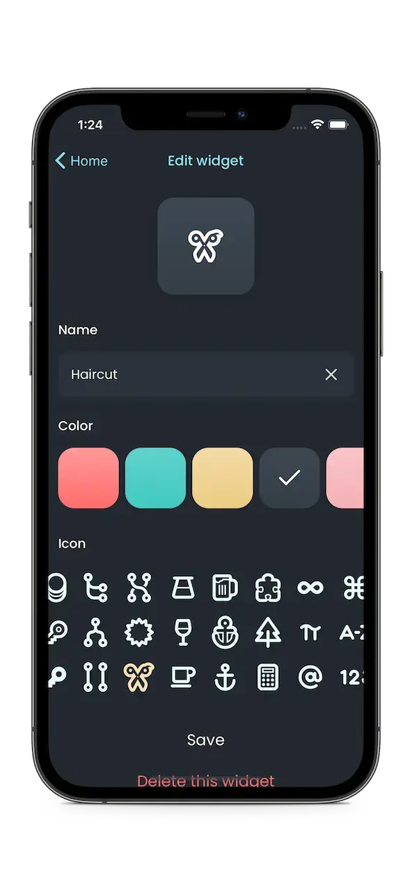
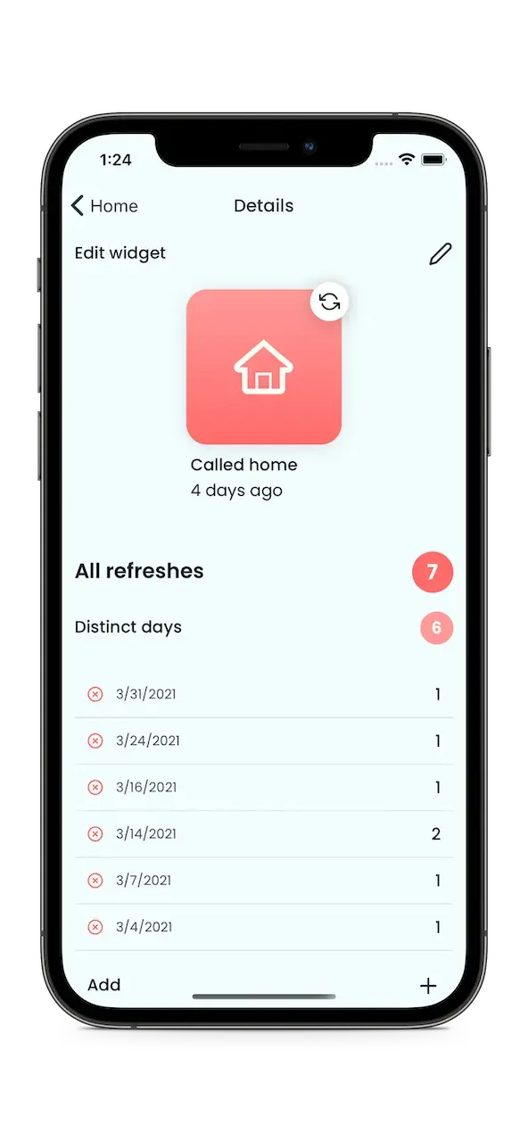
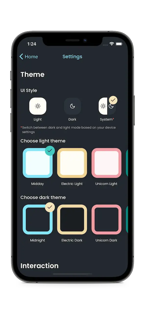
Let's look at the checklist again to see if I passed the coding challenge!
✅ allows users to edit widgets after their creation
✅ allows users to customize widgets (change color/icon)
✅ works well on phone screens - scales well on small devices (iPhone SE 1st generation) and huge devices (iPhone 12 Pro Max)
✅ works well on tablet screens - supports iPad in full screen, split-screen, and Slide Over mode
✅ has an overview of every time an event was repeated
✅ has support for dark mode - also added additional themes
✅ has proper i18n - supports English (US/UK), Spanish, Swedish, Finnish, and, of course, Croatian
Conclusion
It was not easy; I wanted to quit more than once. I kept going because I knew I would actually use the app. When I stalled, I stepped away. The breaks usually sent me back with clearer ideas.
This CommitStrip comic nails how most side projects end.
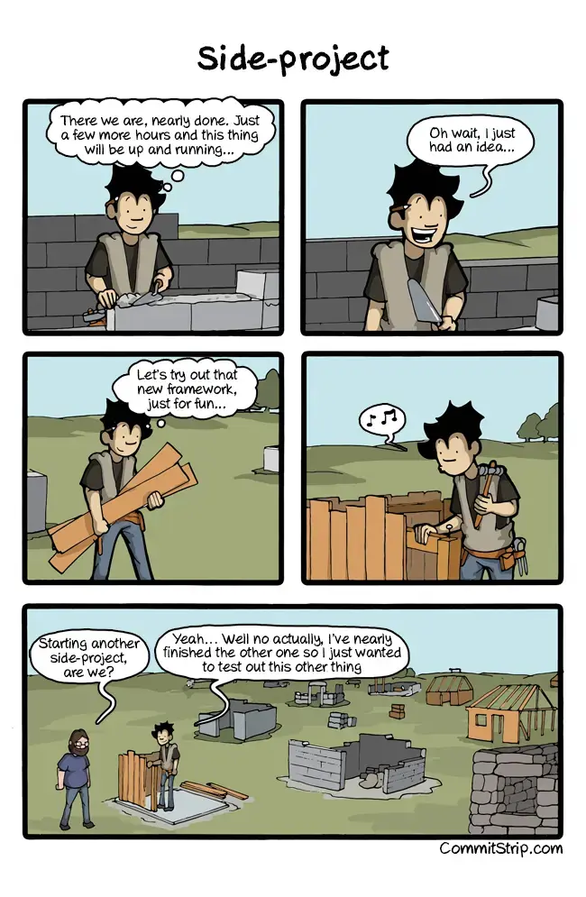
The project is done. I can start the next one without the usual guilt over an abandoned repo.
Download links
