Link to the “Part 1: Who is the user?” sectionPart 1: Who is the user?
Link to the “Interviews” sectionInterviews
We ran nine interviews with professional and hobbyist layout designers. We asked for specific stories about pain points and broken workflows.
The most interesting findings:
- Aligning elements on the page is hard. Some interviewees just eyeball it.
- The UI feels cluttered. One participant compared InDesign and Affinity Publisher to Figma and Sketch. Screen-design tools, they said, show the right controls and hide the rest.
- When interviewees look for a feature, they Google a solution. They skip the built-in guides and help.
- Most interviewees struggle to organize files. They name files "final.indd", "really_finall.indd", "OK_REALLY_FINAL_NOW.indd", and so on.
- Interviewees also struggle to explore alternatives. They duplicate elements, tweak the copy, keep the winner, and delete the rest.
Link to the “Personas” sectionPersonas

John
, 24
- A design student
- Works as a freelancer as a layout designer in spare time

Mary
, 36
- Runs a design agency
- Focuses on advertising products (flyers, billboards)

Leonard
, 27
- Intern at Mary's agency
- Worked with print in a print studio
- Recently switched to digital layout design
Link to the “User Profile” sectionUser Profile
A professional layout designer on a team. They juggle multiple file versions and duplicate pages with small changes. Team members rarely work in the office at the same time. Some pause on one project and switch to another client. They may use naming conventions or cloud-drive workarounds to track versions.
Link to the “Part 2: What is Possible?” sectionPart 2: What is Possible?
Link to the “Design Problem” sectionDesign Problem
Most interviewees struggle to test design variations. They duplicate a page and tweak it, or they spin up a new document to try an idea. The team focused on that problem because it felt worth solving.
The video below shows the process on a simple graphical element.
Link to the “Brainstorming” sectionBrainstorming
We brainstormed twice: a classic list pass, then a video pass. First we dumped every idea and voted.
Then we filmed quick interaction probes from the shortlist. That second pass showed what felt plausible before we invested in higher-fidelity work.
Link to the “Part 3: What Should It Be?” sectionPart 3: What Should It Be?
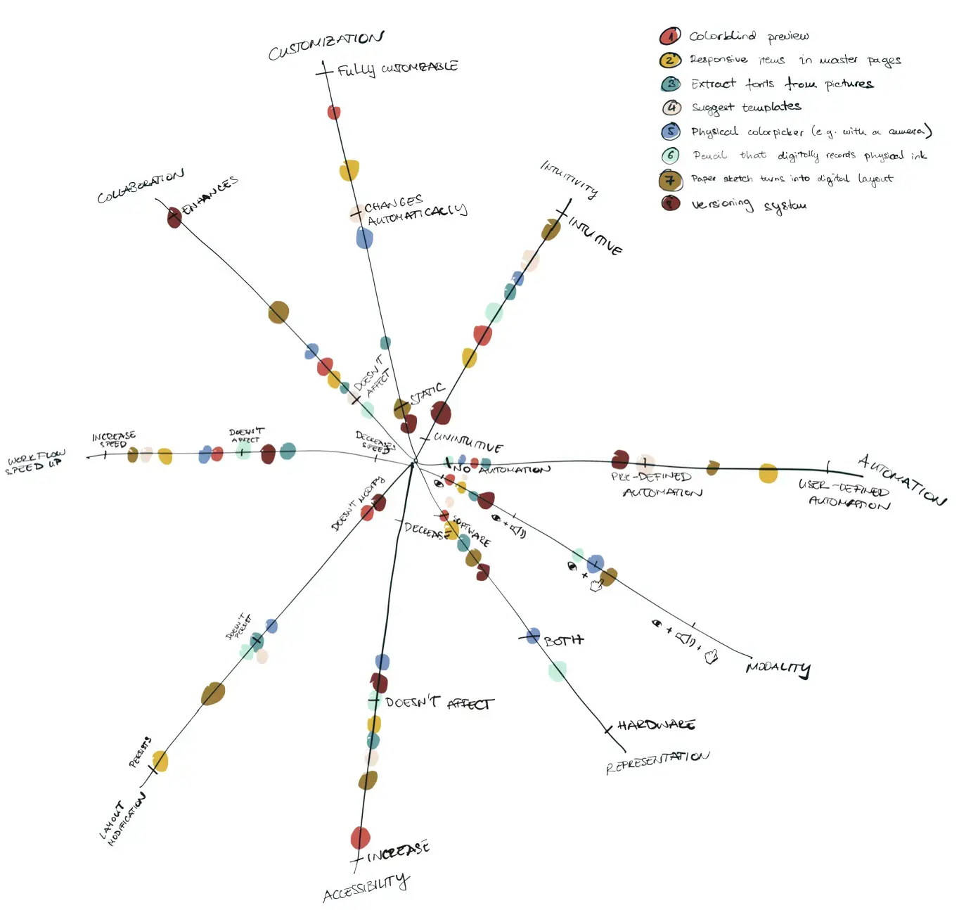
Link to the “Design Space” sectionDesign Space
We pulled out the main dimensions behind the ideas: customization, accessibility, hardware versus software, and so on. We mapped ideas into that space and nudged them along each axis. Gaps showed up fast. That exercise pointed us to where to push next.
Link to the “Design Concept” sectionDesign Concept
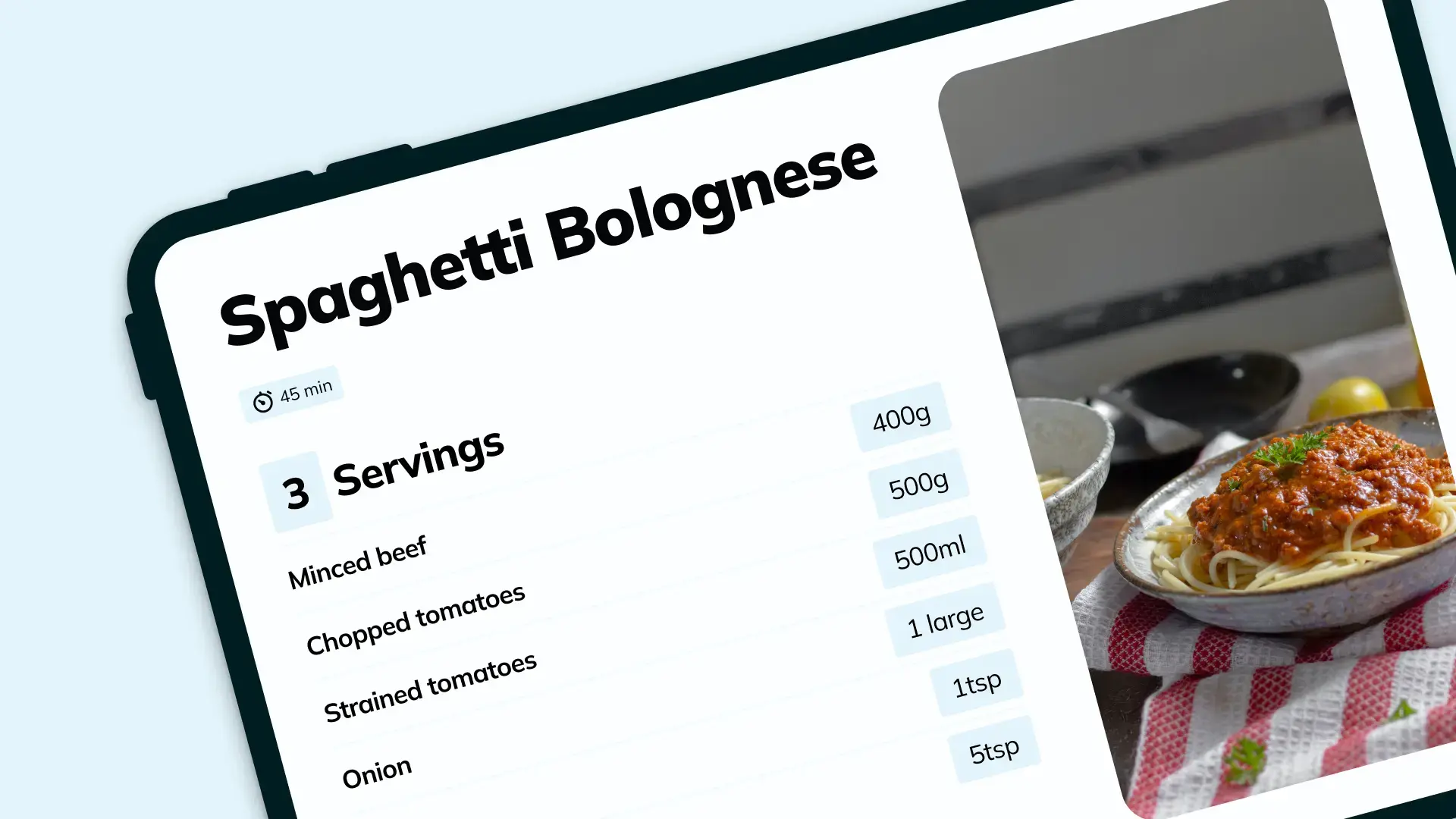
What if versioning applied not only to the document but to anything that changes while you design? What if you could swap versions of a logo, a swatch palette, or a master page layout?
Our design concept:
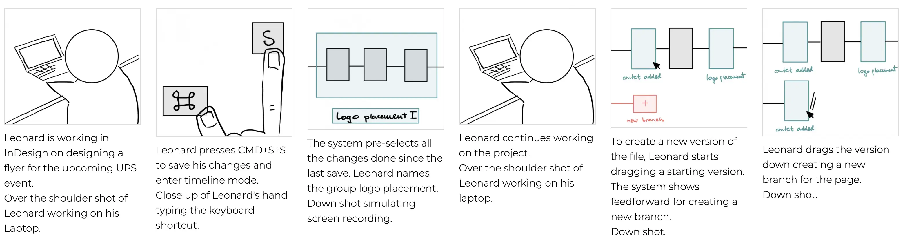
Link to the “Future Scenario & Storyboard” sectionFuture Scenario & Storyboard
We imagined a future scenario where layout designers use our tool at work. Our three personas work on the same project with the tool. From that scenario we drew a storyboard and shot a video prototype.
Link to the “Part 4: Does it Work?” sectionPart 4: Does it Work?
Link to the “Design Walkthrough” sectionDesign Walkthrough
We sat down with peers and walked them through the work. We picked apart each interaction to make the tool more versatile and intuitive.
Some of us know versioning tools like Git. We kept falling back on Git metaphors and had to actively fight to think outside the box.
Link to the “Conclusion & Improvements” sectionConclusion & Improvements
The tool focuses on individual exploration and project organization, not collaboration. Next steps: permission systems so stakeholders can edit their own elements without stepping on designers.
Versioning is hard. No system is perfect. Git is powerful and alien to most layout designers. Code is mostly text; print and digital layout are not. We wanted something visual first, with a gentler on-ramp than Git.